Taking You Higher: Here’s Why We Re-Launched Our Website
Taking You Higher: Here’s Why We Re-Launched Our Website
When you scale businesses from the brand up like we do at Hunt + Hawk, it helps to have a website that showcases your full range of capabilities.
That’s what inspired our new website launch – and why we’re convinced that its mix of striking visual comms, concise creative copy, and portfolio of case studies will elevate every touchpoint you have with our brand.
When co-founders Ryan Devlin and Sonya Vanjicki officially launched Hunt + Hawk in 2017, they were eager to get into the market.
So keen were they to start solving a range of branding, sales, and marketing problems for their burgeoning list of contacts that they – by their own admission – rushed into building their own website.
It’s a common problem for many of our clients and one Hunt + Hawk helps resolve by taking a deep-dive into their brand identity and helping to reshape it with a new one.
Often that includes a complete website overhaul.
But it was getting harder to convince clients of the need to refresh their websites when our own website was looking a little bit worse for wear.
“When we first started out, we were so keen to start making a difference that we perhaps didn’t put as much thought into our own website as we should have.”
“We know from working with our clients the value of updating a website, so we figured it was about time we did the same.”
Yet it’s not simply a case of out with the old and in with the new.
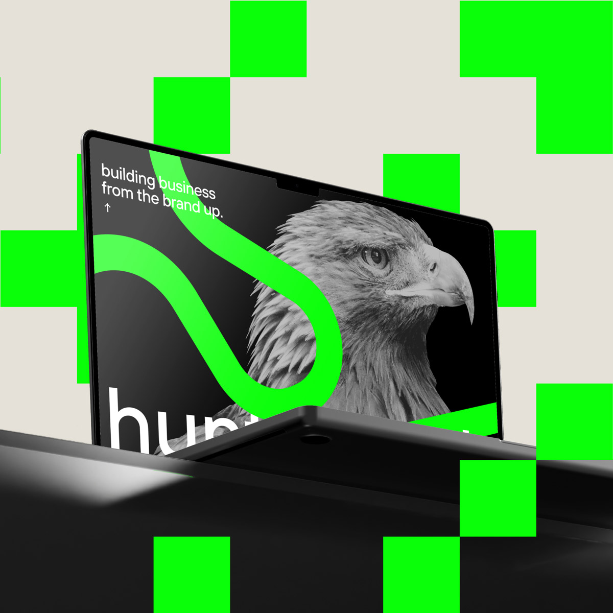
Almost a year of research has gone into the new site, along with custom-written copy and far sleeker, decidedly more eye-catching designs.
Utilising a striking green-and-black colour scheme and a recurring strapline of we take you higher – not to mention a unique bottom-to-top scroll – it’s a site that showcases Hunt + Hawk’s full range of capabilities and one designed to inspire as much as it is to inform.
The unique scrolling system – inspired by the notion of elevating your website experience – as well as the scattered ‘easter eggs’ hidden throughout the site, are a nod to both the team’s creative side and a reminder of the type of website design we execute for our clients.
Angelo Alcasabas has been Hunt + Hawk’s long-serving Design Director since 2021.
He says the new website is the perfect mix of serious design and a fun-loving tone of voice.
“I think it breaks conventions,” Alcasabas said.
“I think it really embodies what our DNA is as both a company and a brand.”
Pointing out that the new website has been created to be both a serious showcase of the firm’s portfolio of work and a tongue-in-cheek glimpse into our unique sense of humour, Alcasabas says he’s delighted with the finished product.
“I think a lot of agency websites take themselves so seriously,” he said.
“What we’ve done is added a little bit of fun – and that sense of playfulness really ticks a lot of boxes for us as a brand.”
It’s a sentiment echoed by Hunt + Hawk co-founder and branding expert Sonya Vanjicki, who says the suite of visuals designed by Alcasabas and his creative team are not just there for show.
“We know 55% of brand first impressions are visual,” Vanjicki said.
“Which means the battle for recognition begins by creating our own unforgettable visuals and combining them with a tone of voice that gets us noticed before we even enter a room.”
Having worked with a diverse roster of clients across the SaaS, tech, financial, and healthcare landscapes to date, the agency is keen to continue helping clients to maximise the impact of their branding, sales, and marketing.
From bespoke brand messaging to custom marketing campaigns, website re-designs and full HubSpot integrations conducted by the agency’s in-house CRM expert Ryan Devlin, there’s no limit to the sort of work Hunt + Hawk can do in what is a hugely competitive digital landscape.
“We’ve got a highly experienced team of graphic designers, campaign managers, content marketers, and branding and sales experts at our disposal,” Devlin said.
“With the Virtual Chief Marketing Officer (VCMO) services we offer and the fact you can literally have an entire in-house team of creatives working on your business, there’s never been a better time to think about updating your branding and attracting new customers.”
With so many competitors vying for every last scrap of attention – and dollar – in this crowded digital landscape, businesses that fail to update their brand risk being left behind.
It’s why Hunt + Hawk is so keen to elevate every touchpoint and experience our clients have with the business.
“Our new brand identity is literally based on the concept of us taking you higher,” Vanjicki explained.
“We’ve consciously elevated every element of our branding – and that’s something we’re keen to continue doing for our clients across Australia and the rest of the world.”
Simply send us a message to find out how we can help.