FinTech SaaS
EMEA, USA, Asia
Banks, CTOs,
Inspiring change in risk averse clients
Full rebrand, website, vCMO, vCSO and CRM
Secured $6.2m in funding, and Teslapay,
amongst many others, as a client
Geniusto came to us with enthusiasm to grow, a name with potential, and global banking software solutions so strong that they counted startup banks and major established global banks as clients.
Their biggest problem was a mesolithic brand that hadn’t been updated in over 10 years—and wasn’t helping win clients in the increasingly competitive world of back-end banking systems.
We took on the challenge of a full rebrand—from core copy to visual identity to website structure—with a relish that translated into a year-long engagement on vCSO and vCMO which grew the company 3x within 2 years.
Banking software. Not something that gets many people hot and bothered. And as institutions, Banks are risk-averse, and convincing them to change is a challenge. When that change means using new software to do everything from identity verification to customer communication to app development, that reluctance to change can be colossal.
Surveying Geniusto’s competitors told the tale—most brands were speaking to banks like they were banks, not people.
But when we empathy-mapped the pain points and desires of key decision-makers, we found that treating the banks more like their own consumer-facing advertising treated their own customers was a breakthrough approach that could turn the tables on getting noticed—and keeping traction.
Put more brains behind your banking was the core concept. Direct language, commanding action, confidently using clever, consumer-facing style. Brighten up your payments and Thinking around corners led campaigns that showed the cleverness of the brand.
Visual identity used a kinetic treatment of the G in Geniusto to depict dynamic product adaptability and brand friendliness to internal banking users and end-users alike.
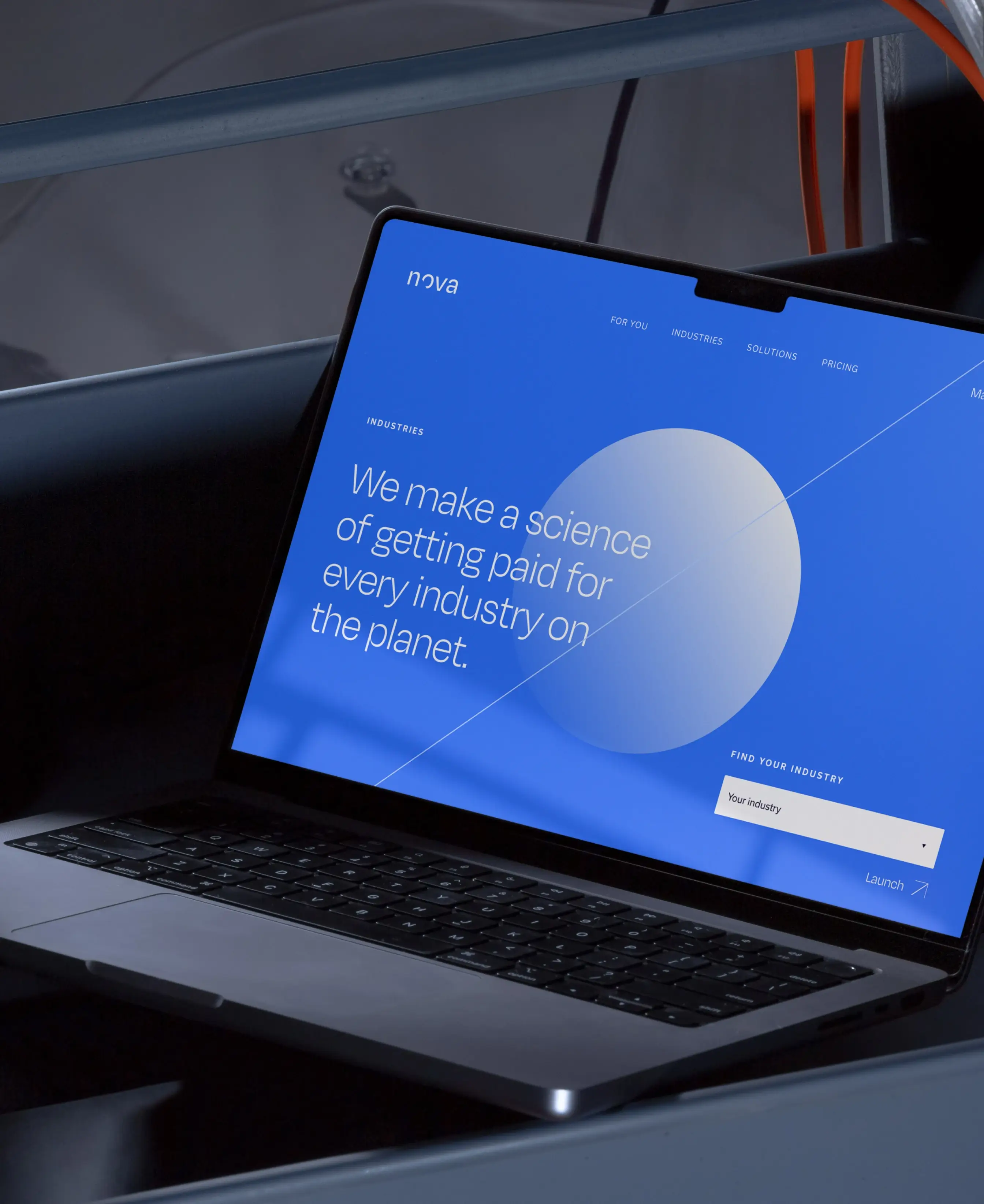
A website execution with bright, modern palette and plenty of white space further emphasised the usability and consumer-friendliness people expect of modern software. Complex product architecture was rendered simple and comprehensible with clear infographics, and stylised screenshot elements that showed look and feel without difficult detail.
The website showed industries and articulated detailed case studies from all over the world, while using its 40+ pages to leverage SEO and UX in equal parts, all combining to plug into a sales funnel redesigned buy our vCSO and vCMO teams to take advantage of global campaigns.
The integrated rebrand, website, and campaigns running across platforms dovetailed with a sponsored industry event plan and geographic expansion that won a lot of eyeballs. $6M in funding was secured, and the company grew 3x in 2 short years.
“They did the impossible—they made our banking software feel smart, even sexy, to clients”.
Matthew Edmunds
CEO, Geniusto
Smart, sexy…
banking system?
Matthew Edmunds
CEO, Geniusto