The Power of Typography in Creating Great Design
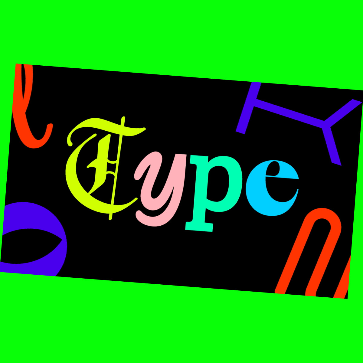
The Power of Typography in Creating Great Design
Index
The power of typography should not be underestimated. We explain why…
Words are everywhere.
We may live in an increasingly visual world, but the average person still reads thousands of words every day.
That’s a lot of opportunities to influence your audience, provided you can grab their attention to begin with.
There’s hot competition in a world of shrinking attention spans and ever-increasing amounts of content.
We’ve been reading printed words for more than a thousand years. But it wasn’t until the invention of the modern printing press around 1450 that we started to think more deeply about typography.
The first books were densely printed and difficult to read, and type was set manually by hand.
These days, computers take care of typesetting for us, but that doesn’t make typography – or the way we assemble words on a page or piece of content – any less important.

More to Design Than Just a Great Logo
Consider your first impression of a brand.
Did you notice the logo? Of course you did!
Logos are designed to capture our attention and draw the focus of our eyes onto a prime piece of marketing real estate. They’re one of the fundamental building blocks for creating a strong brand and one of the first things most people take note of.
You might also have noticed the colours. As any decent designer will tell you, colour schemes play a key role in underscoring the psychology of a brand.
While there are always exceptions to the rule, warm tones are mostly used to generate feelings of positivity, while darker colours are often reserved for more dramatic moods and content.
More than just a spur-of-the-moment decision, there’s plenty of science that goes into choosing an appropriate colour scheme.
But the first thing you saw is probably the last thing you noticed. Sure, typography might not be the most eye-catching element of graphic design – even if it’s one of the first things designers always think about!
However, the way we combine elements like font, size, contrast, and colour plays just as important a role in the creation of a clear brand identity and compelling tone of voice.
At its core, typography helps stir an emotional response and gives context to the words we read. Dull typography can leave us feeling flat and uninspired. Or worse still, force us to stop reading the content entirely.
But good typography – the sort that stops you in your tracks and commands you to pay attention – can be the all-important starting point between capturing an audience’s attention for the first time and convincing them to take action.
Choose a Font That Matches Your Voice
Here’s a fun fact – there are more than 200,000 different fonts around the world. That’s a lot of design decisions to make!
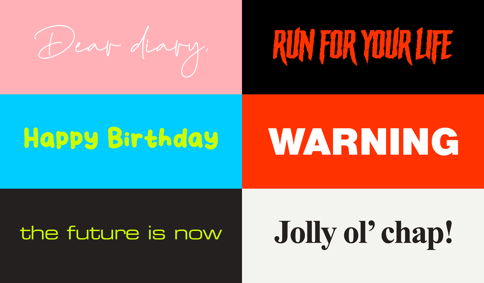
And while the sheer volume of fonts may seem overwhelming, a great designer will always match your font style to your tone of voice and brand messaging.
Let’s highlight some examples…
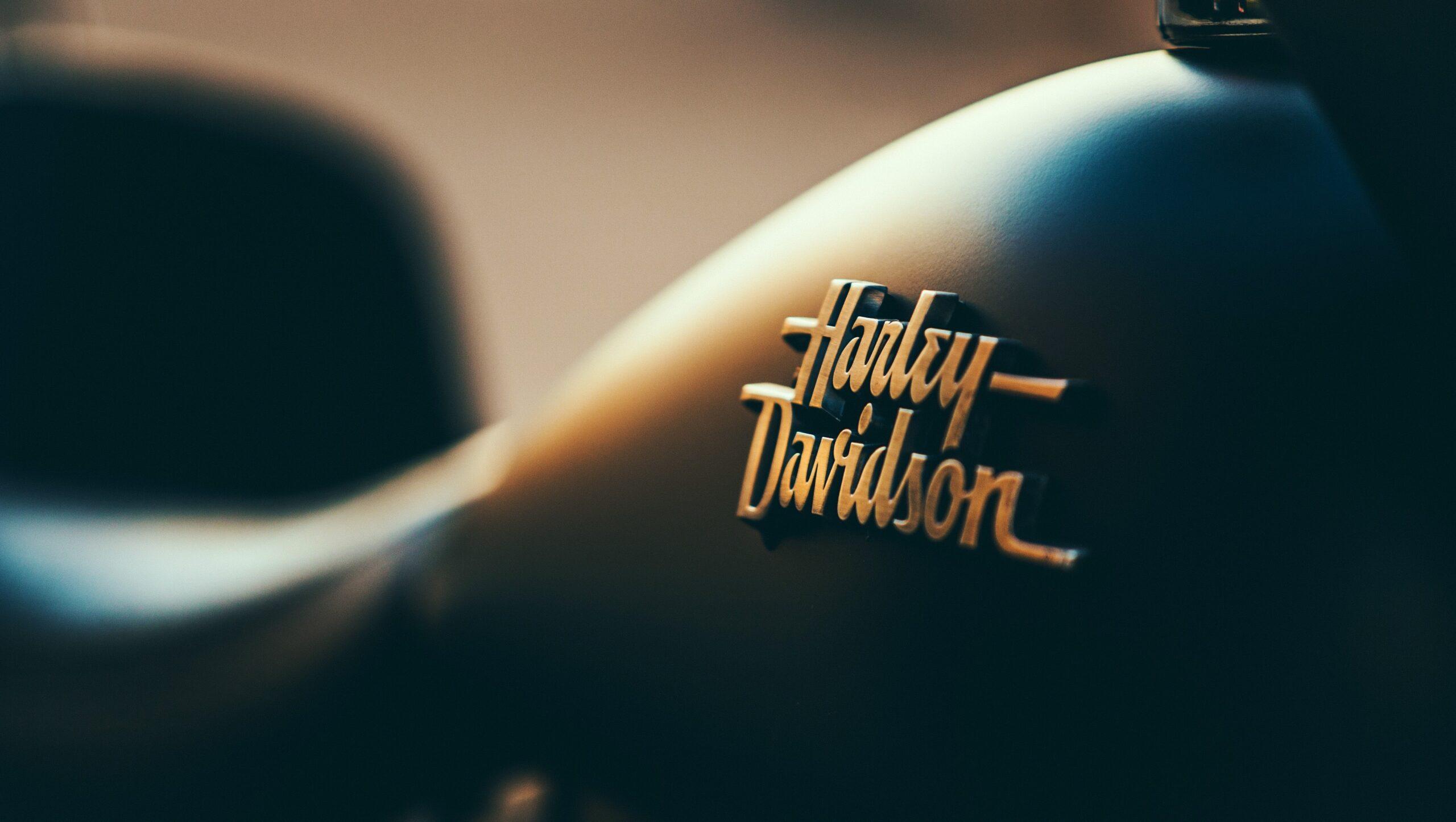
Keen to create a human connection? Consider a script font that resembles a handwritten note. Or how about creating an air of leadership and authority? You could use a serif font like Times New Roman that harks back to the days of newspapers.
Rather than feeling limited by the number of fonts available, a great designer will always select a font with a personality that matches your brand’s voice and positioning.
Forget Everything You Heard – Size Matters!
Consider the space your content takes up on a page. Does it suit the tone of your messaging?
Thinking of size as volume is helpful in determining how much space your font should occupy.
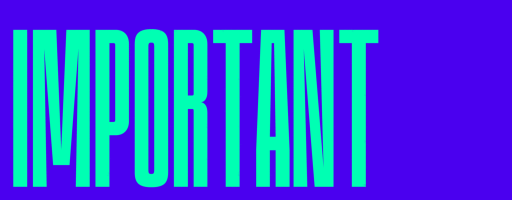
Using oversized type that takes up a lot of real estate is a great way to draw the eye and create a sense of authority.
On the flip side, using a smaller, less eye-catching font is a subtle way to establish a feeling of calm and a quieter tone of voice.
Best of all, you can mix and match the two to create clear hierarchies of information.
Want to shout the most exciting part of your message from the rooftop? Use a larger font. Need to include some less-important information like dates and locations? That’s what smaller fonts are for.
Alternating font sizes is a great way to establish hierarchy in your visual communication and make a bold statement that captures attention, while still including all the relevant information.
Contrast – What Does It All Mean?
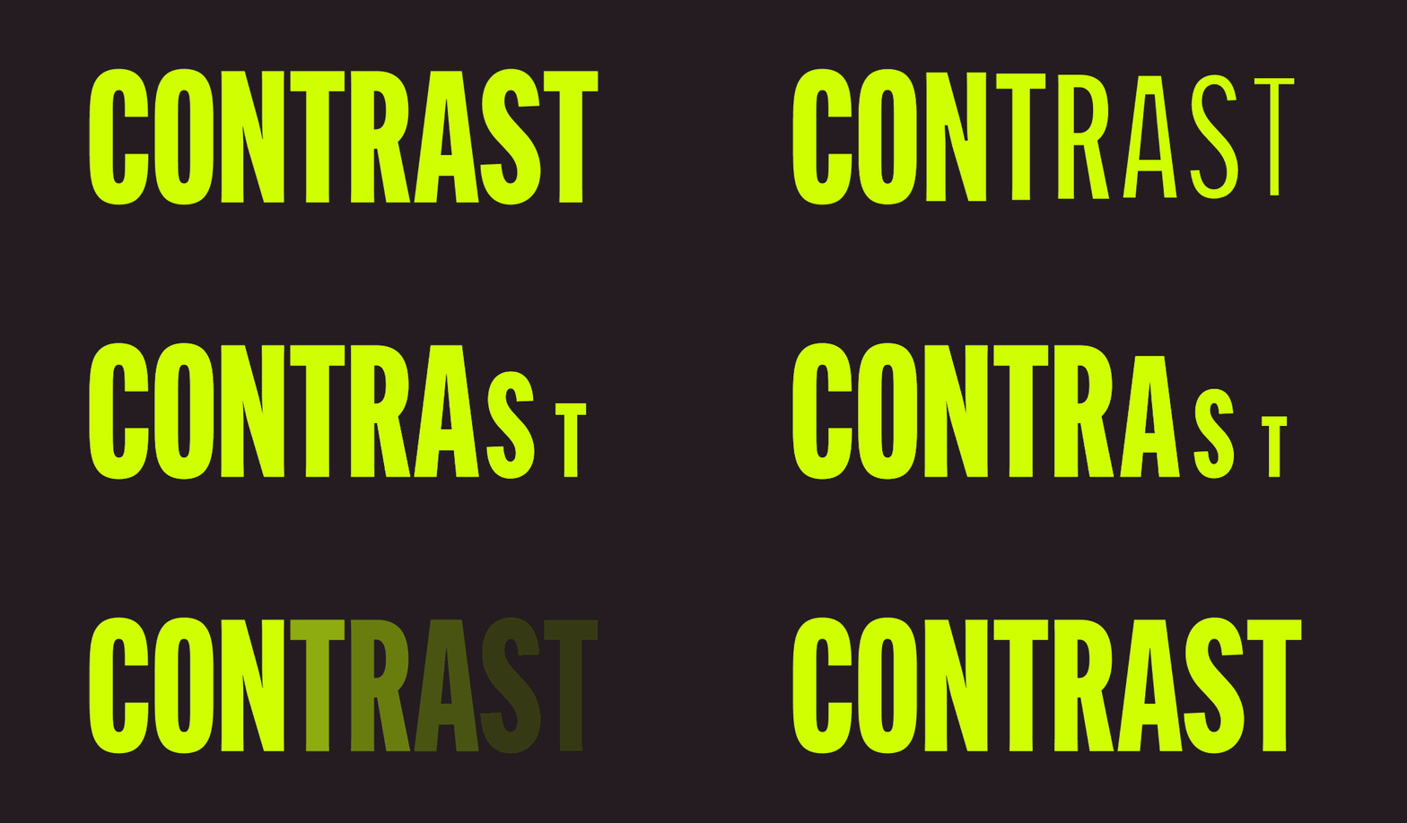
Contrast in typography is simply the way we create meaning by accentuating differences. You can find an example in this article – the headline is larger and in a bolder font than the body copy. That’s because it provides key context to the article.
Without the headline, and without using typography that draws the eye to it, we’d have no idea what the article is even about.
But there are other ways to achieve contrast and establish hierarchy within your layout.
You can increase or reduce the type scale and experiment with different point sizes. You can change the weight of your typography by using a bold font on certain words for emphasis and clarity.
And you can use a combination of different fonts to make specific lines or sentences stand out, directing the eye where you want it to go and helping to establish a more personal tone of voice.
Experimenting with different weights, treatments, and font sizes not only allows you to create contrast, it also helps to establish the tone of voice you use throughout your content.
Don’t Discount the Importance of Colour
If you think the LinkedIn articles of today look similar to the newspaper articles of a hundred years ago, that’s because a classic serif font in black set against a contrasting background of white still conveys an air of authority.
But there’s only so much you can do with black or white.
Black text on a white background might be the default typography for a reason – it is, after all, easy to read – but that doesn’t mean you should discount the importance of colour.
The psychology that goes into choosing the right colour scheme plays a powerful role in building a memorable brand.
Combine a bold font with bright, contrasting background colours to inject an element of playfulness into your typography. Or use darker tones of reds, purples, and even royal blues to offer a sense of luxury.
And don’t forget the stop sign! That familiar white text on a red background is the perfect example of pairing an authoritative font with a striking background that grabs attention and demands a response. That’s why warning signs often use similar typography.

Typography and Design Professionals
By now, it should be clear there’s so much more to great design than just making the logo bigger.
And the power of typography is something we unleash every day at Hunt & Hawk, because we live and breathe every element that goes into creating outstanding brands.
Do you need design support that delivers outstanding results for your business? Reach out to us today.
How would you like to interact with us?
- I’m just browsing: Explore more of our website.
- I’d like to send an email: Contact us at hello@huntandhawk.com.
- Help! Right now! Book a meeting to chat.
For more marketing, branding, and sales tips and insights, check out more of our blog.