Bluey Went 3D and the Internet Lost It. Here’s Why the Fans Might Be Wrong (And When They’re Not) – Evolving a global brand
Bluey Went 3D and the Internet Lost It. Here’s Why the Fans Might Be Wrong (And When They’re Not) – Evolving a global brand
I need to declare an interest before we start. Bluey is partly responsible for me living in Brisbane again.
After fifteen years in the UK, the decision to move home was built on all the sensible things: family, lifestyle, opportunity. But I’d be lying if I said there wasn’t something else in the mix. Somewhere in those last few years, my kids fell in love with a cartoon dog from Brisbane, and I fell harder. Every episode was a Queenslander house, a jacaranda, a backyard that looked like the ones I grew up in. It was seven minutes of home, playing tour guide for my kids to all the landmarks they had never visited. The kids loved Bluey and learning about the heritage they hadn’t experienced. Until suddenly, my family of imports were here.
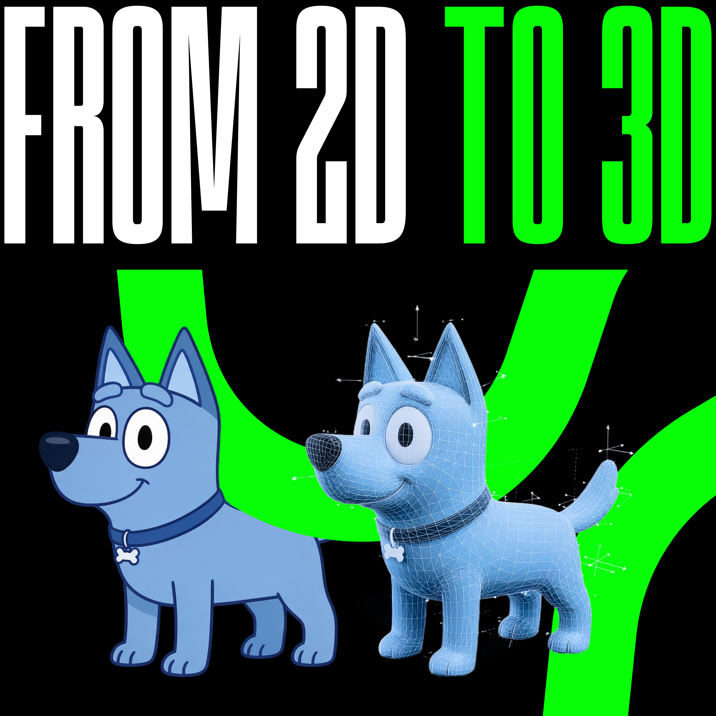
So when the first look at The Bluey Movie landed a couple of weeks ago and revealed that the Heelers are going 3D for the big screen next year, I felt the same little shock as everyone else. And then I watched the internet do what the internet does. Comments filled with disgust and grief. People declaring the decision one of the dumbest in animation history. The Godfather “look how they massacred my boy” GIF doing heavy rotation. YouTube comments reportedly switched off on the trailer.
Here’s the uncomfortable thing I want to work through, as a fan and as someone who does brand strategy for a living: I think the fans are asking the wrong question. And I think the answer matters for every business owner reading this, because your brand will face its own version of this moment eventually.
The strongest version of the objection isn’t “I don’t like change.” It’s that the flat 2D style, the bold outlines, the simple backgrounds, the storybook warmth, isn’t decoration on top of Bluey. It IS Bluey. The argument goes that the visual simplicity is a load-bearing part of the show’s identity, and swapping it for glossy CG swaps out the soul.
In brand terms, that’s a claim about distinctive assets. And it’s half right. Bluey’s look is absolutely a distinctive asset, in the same category as its particular shade of blue, the Queenslander architecture, the seven-minute episodes, and the fact that the parents are the best characters. Distinctive assets are the things buyers, or in this case viewers, use to recognise the brand without reading its name. Mess with them carelessly and you genuinely can break something.
But here’s where the argument gets bum worms. The fans are treating one asset, the rendering style, as if it were the brand itself. It isn’t. The brand is the meaning: the specific, gentle, funny, deeply Australian truth-telling about family life that made a kids’ show into the thing exhausted parents watch after the kids are in bed. The 2D style is a vehicle for that meaning. It is not the meaning.
And vehicles change as the journey progresses. They don’t last forever, and if they don’t change and evolve and get repairs, eventually they break down and are left to rust.
If anyone knows me, they know I’m a bit of a cinephile. A seven-minute episode on a lounge room telly and a feature film on a twenty-metre cinema screen are not the same product with different durations, dimensions and resolutions. They’re different formats with different physics. What reads as charming simplicity at 55 inches can read as thin at cinema scale, across ninety minutes, at cinema ticket prices, against every other family film in the market. The creative team that built the show, including creator Joe Brumm and returning co-director Richard Jeffery, remains at the heart of the film. These are not outsiders vandalising the brand. They are the people who understand it best, making a format call.
There’s a precedent the critics keep citing as a warning that is actually the opposite. The Peanuts Movie in 2015 faced exactly this panic: sixty years of flat, hand-drawn Schulz linework heading into CG. The result honoured the 2D sensibility inside the 3D format, kept the hand-drawn imperfections, and was embraced by critics and audiences. The lesson wasn’t “never change the style.” It was “translate the distinctive assets faithfully into the new format.” Disney made a similar call with the Diary of a Wimpy Kid movies, stepping back from live action to an animated style that could give the series longevity that aging-out child actors couldn’t deliver without replacing the faces of the brand every few years. That’s the standard The Bluey Movie should be held to, and from less than a minute of teaser, nobody can yet say whether it has met it.
Honesty requires the counter-example, and it’s a good one. The first Sonic the Hedgehog movie design was so poorly received in 2019 that the studio delayed the film and redesigned the character. The fixed version helped the film succeed and avoided what could have been a trainwreck had it alienated its primary audience. Fan revolt, brand listened, brand won. So the “we can bully them into changing it” crowd isn’t fantasising. It has happened.
The difference is worth being precise about. The Sonic backlash wasn’t resistance to evolution. It was a correct diagnosis that the new design had abandoned the character’s distinctive assets, the proportions and features that made Sonic recognisably Sonic, and replaced them with something uncanny. The fans weren’t defending nostalgia. They were defending recognisability. When a redesign breaks the assets, listen. When a redesign translates the assets into a new format and people simply grieve the old one, hold your nerve.
There are fans, and then there are ‘Fans’. Some have a sincere love of a property, feel genuinely invested in it, consume the ecosystem, and contribute to the revenue and future success. Others are fans in name only: armchair heroes who roam online looking for outrage and causes to pursue, thrusting their opinion forward as the most important in the room, and who don’t actually go to the cinema at all. A word of warning when it comes to listening to the latter. Their opinions, though interesting, are irrelevant unless they can be backed up by data.
How to Train Your Dragon was a beloved animation that moved to live action after completing the arc of the story told in the movies (completely different to the books). They had the chance to rewrite the story when they made the live-action version, but instead of confusing the fans of the new story, who had joined the journey midway through the evolving brand’s life, they doubled down on the evolution, used the same director as the animation, recreated it almost shot for shot, faithful to the original, and it was a huge cinematic success at the box office.
Then there’s this year’s Masters of the Universe (He-Man) movie. It had a rough run at the box office, initially critics were mixed mirrored by ticket sales but audiences who did see it loved it, with an emphatic audience approval score, largely because it stayed true to its core brand identity: the care and attention in the costumes, the characters, and the general campness of a grown man running about in a loin cloth. The reward for that fidelity arrived on a delay and in a different format. When it hit streaming, it went straight to the top of the charts and became the most-watched title across every platform in its debut week, as everyone caught up on what they’d missed during its underwhelming theatrical run. Brand faithfulness got paid. It just got paid somewhere other than the cinema.
Don’t get me started on Star Wars and Marvel ‘Fans’ and the mess they have made with the directions of those franchises with their toxic trolling. I could write a thesis on market research and how it can kill a great idea before it has had a chance to mature. But I digress…
Which brings us to the traditional rebrand hall of fame and shame, because business history has run this experiment many times.
Gap, 2010. Swapped one of the most recognised logos in retail for a generic Helvetica treatment, with no strategic story attached, and reversed it within about a week under public pressure. The failure wasn’t changing. It was changing a distinctive asset for nothing: no repositioning, no new audience, no format demand. Change without a reason is just vandalism of your own equity.
Tropicana, 2009. Redesigned its packaging away from the iconic orange-with-a-straw, sales fell hard within weeks, and the old design came back. Same lesson: the asset was doing silent commercial work, and nobody had measured it before discarding it.
Royal Mail in the UK becoming Consignia, 2001. Abandoned centuries of accumulated meaning for an invented word, and after it failed to land with consumers, reversed course back not long after. Equity is expensive to build and free to throw away.
Now the other column. Burberry dragged itself from chav-check punchline back to luxury by evolving relentlessly while protecting its core brand assets and staying one step ahead of the market stall bootleggers hijacking their distinctive design. Old Spice repositioned a dying dad-brand into cultural relevance without changing its name or its ship, launching a fun, transformative ad campaign that made it iconic in its space. Lego nearly died in the early 2000s chasing everything, then grew into the world’s most valuable toy brand by refocusing on what the brick means while radically evolving formats, films, games, and adult product lines included, chasing their core audience as their demographics evolved and evolving the brand with them. Evolution of meaning and format, preservation of distinctive assets. That’s the pattern, every time, in both columns.
Here’s the part that stings a little to write. The loudest voices in the Bluey backlash are people like me: adults who love the steady, safe hand of fun, wholesome, child-centric entertainment that plays out our childhoods on the screen. The show is a nostalgia engine. And nostalgia wants brands to be fixed points. It wants Bluey preserved in amber at the exact moment it first made us feel something.
But brands that serve their audience’s nostalgia instead of their audience’s future become museums. Bluey’s actual primary audience is being born right now. The kids who’ll be six when this film releases in 2027 have no contract with the 2D style. Notably, early anecdotes from parents suggest exactly this split: the young kids watching the teaser are simply excited to see their favourite characters come closer to real life, while the older fans are the ones clocking the animation. A brand at Bluey’s scale has to grow with its audience and its formats, or it becomes a fondly remembered thing rather than a living one. Staying still is not a neutral choice. It’s a slow death.
The strategic question for Ludo and Disney was never “will the superfans grumble?” Superfans grumble and then buy tickets; stated preference and actual behaviour part company constantly, which is exactly why smart brands weigh what audiences do more heavily than what comment sections say. The real question is the Peanuts question: does the new format carry the meaning? Does it still feel like a children’s book come to life, like a Brisbane backyard, like your own family with better scriptwriters? If the answer in August 2027 is yes, the animation debate will be forgotten by the closing credits. If the answer is no, no amount of 2D would have saved it anyway, because the problem was never the dimension count.
The bigger challenge will be taking the short-form, seven-minute micro adventures to a 90-plus-minute grand scale without losing young viewers’ attention along the way. But if, like me, you saw the hints of this in “The Sign” at the end of season 3 and watched how masterfully they handled taking it to nearly 30 minutes, you’ll be equally entertained seeing how they navigate their audience’s attention span for 90 minutes… then as it’s rewatched, again, and again, and again.
You’re probably not taking a cartoon dog to cinemas, but the same forces are working on your business. Your longest-standing clients are your nostalgia caucus. They liked you how you were, and they’ll tell you so. Meanwhile your market, your formats, and your future buyers are moving.
The playbook the winners share is simple to state and hard to do. Know which of your assets carry recognition, your name, your voice, your visual signatures, the things clients would miss, and protect those fiercely. Then evolve everything else as boldly as your market and formats demand, with a strategic reason you can articulate in one sentence. If you’re not sure whether your business needs a light touch-up or a full overhaul, our guide on B2B Brand Refresh vs Rebrand walks through how to tell which you actually need. And when (if) the grumbling starts, diagnose it and understand it before making any knee-jerk decisions to reverse course. If people are telling you you’ve broken your assets, which is the Sonic signal, act on it before they find it elsewhere. Or are they telling you they miss the past, which is the Gap-in-reverse trap? Thank them warmly, share your vision of the future, hold your course, and bring them along with you.
Brands are not fixed points occupied by other people’s fondness. They’re living systems, and living things grow.
I’ll be at the cinema on Bluey’s opening weekend with my two-year-old daughter in tow, excited to see what the future of one of my favourite brands holds. I’m excited to see a fellow Brisbane local evolve on the world stage with my complete support.
Wondering whether your brand should evolve or hold still? That diagnosis is the conversation to have before any designer opens a file. Talk to Hunt + Hawk.
Should brands change their visual identity if loyal customers object?
It depends on what the objection is diagnosing. If customers are signalling that a change has destroyed the distinctive assets they use to recognise and trust the brand, as with Gap’s 2010 logo or the first Sonic movie design, listen and correct. If they’re expressing attachment to the past while the change serves a clear strategic purpose, a new format, a new market, a growing audience, brands should generally hold their course, because stated objections rarely predict actual behaviour.
What are distinctive brand assets?
Distinctive assets are the recognisable elements, names, colours, shapes, sounds, characters, and styles, that audiences use to identify a brand without conscious effort. They do silent commercial work and should be identified and protected before any rebrand. The most common rebranding failure is discarding an asset nobody realised was load-bearing, as Tropicana discovered when it changed its packaging in 2009.
When is the right time to evolve a brand?
When the business, audience, or format has genuinely changed: new markets, new generations of buyers, new channels, or repositioning after drift. The wrong time is boredom with your own identity or pressure to look contemporary. The test is whether you can state the strategic reason for the change in one sentence, and whether your distinctive assets survive the translation.
Does Hunt + Hawk help with rebrands?
Yes. Hunt + Hawk is a Brisbane-based creative, branding and growth agency helping SMEs across South East Queensland evolve their brands deliberately: auditing which assets carry recognition, defining the strategic case for change, and carrying the evolved brand through marketing and sales so it performs commercially, not just visually. If your brand is due to grow up, get in touch.