Financial Services / Outsourced CFO & Accounting
Carlton South, Victoria, Australia
Business owners and leadership teams outgrowing DIY finance
Dated, generic identity out of step with a sophisticated advisory offer
Full brand identity, logo system, and visual language
A distinctive, boardroom-ready brand built to scale across every touchpoint
The CFO Solution had already built the thing that’s hardest to build: trust. As an outsourced CFO and accounting partner, they were doing sophisticated, high-stakes work for growing businesses, the kind of work that expands what a client can actually achieve, not just what their books look like.
The problem was that their brand hadn’t caught up. The old mark, a boxy orange-and-navy lockup that read more “print shop” than “trusted financial partner” was doing nothing to signal the calibre of thinking behind it. For a firm whose entire value proposition is precision, authority and bespoke strategy, a generic identity was actively working against them.
They needed a brand that looked like what they actually are: sharp, considered, and built for businesses who refuse to settle for a one-size-fits-all advisor.
Financial services branding has a default mode: navy, a serif wordmark, a vague icon implying “growth.” It’s safe, and it’s exactly why so much of the category is invisible.
The CFO Solution’s own words gave us the way out. Their brief and why statement weren’t about safety, they were about expansion. About proving, repeatedly, that off-the-shelf advice caps what a business can become, and that real impact requires a partner willing to go deeper.
That tension between the discipline finance demands and the ambition it should unlock became the brief. We needed a mark that felt authoritative and accurate, but never rigid. Something with enough structure to signal rigour, and enough openness to signal possibility.
We benchmarked against the category’s usual suspects — Mertons, Leydin Freyer, BoardRoom, Automic and deliberately looked outside it too, toward bolder, more geometric identity systems that treat structure as a design feature rather than a constraint.
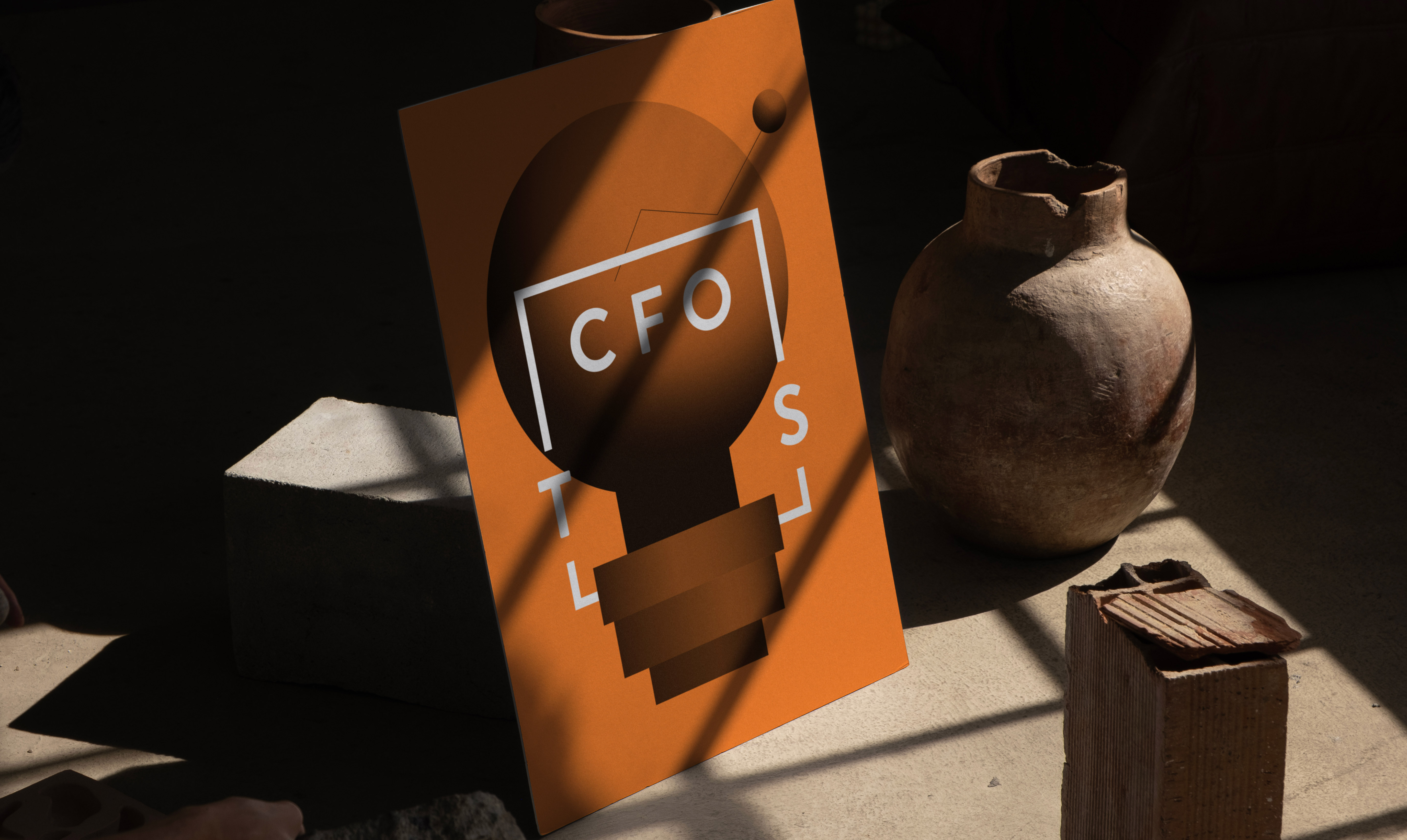
The concept that emerged centred on a single architectural device: an open bracket.
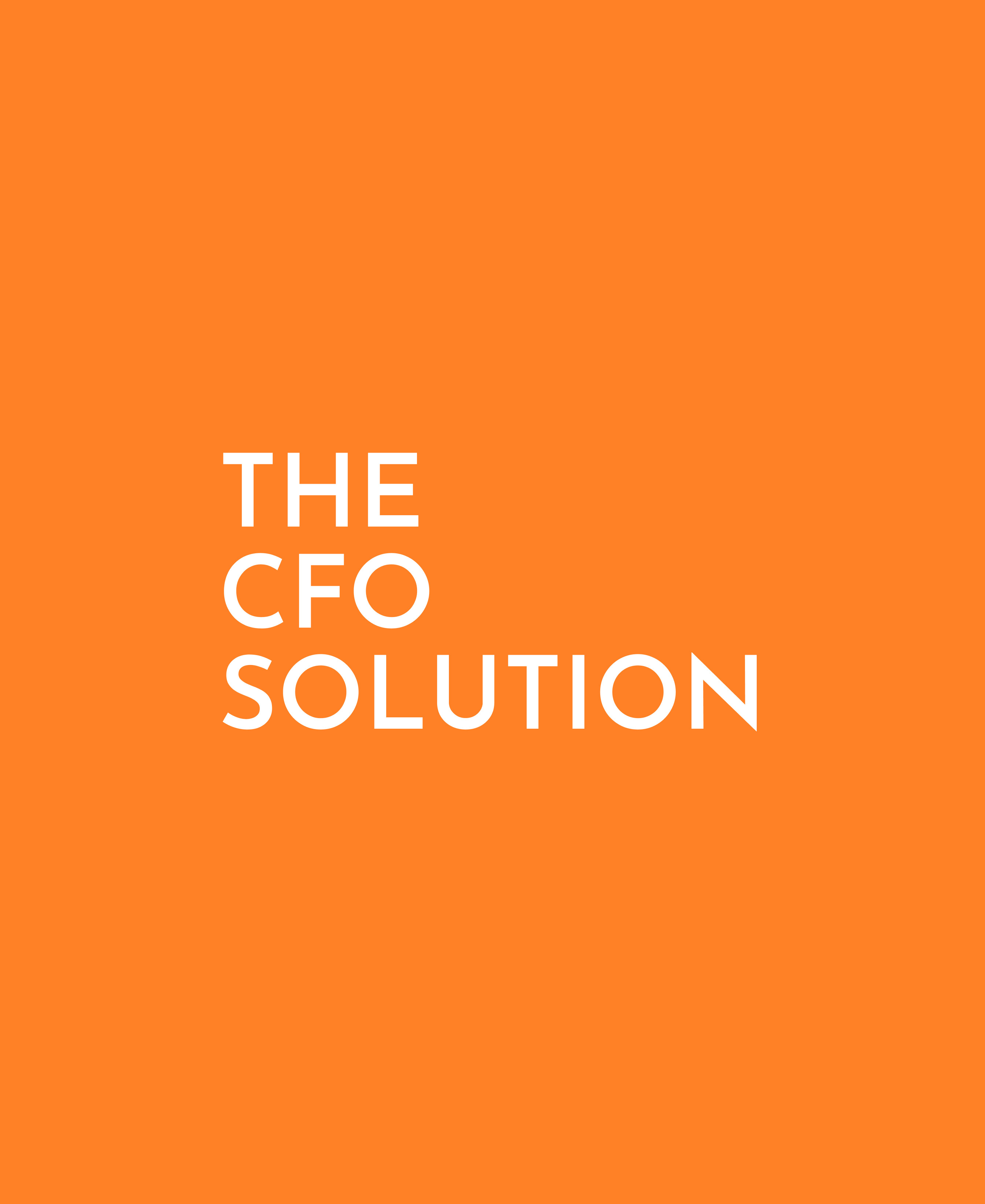
Two L-shaped lines one holding “THE” and “CFO,” the other holding “SOLUTION” — frame the wordmark like a set of coordinates, or the corners of a ledger. It’s a shape that reads instantly as structured and precise, but because the bracket stays open rather than closing into a box, the mark also implies room to grow. Nothing about it feels boxed in.
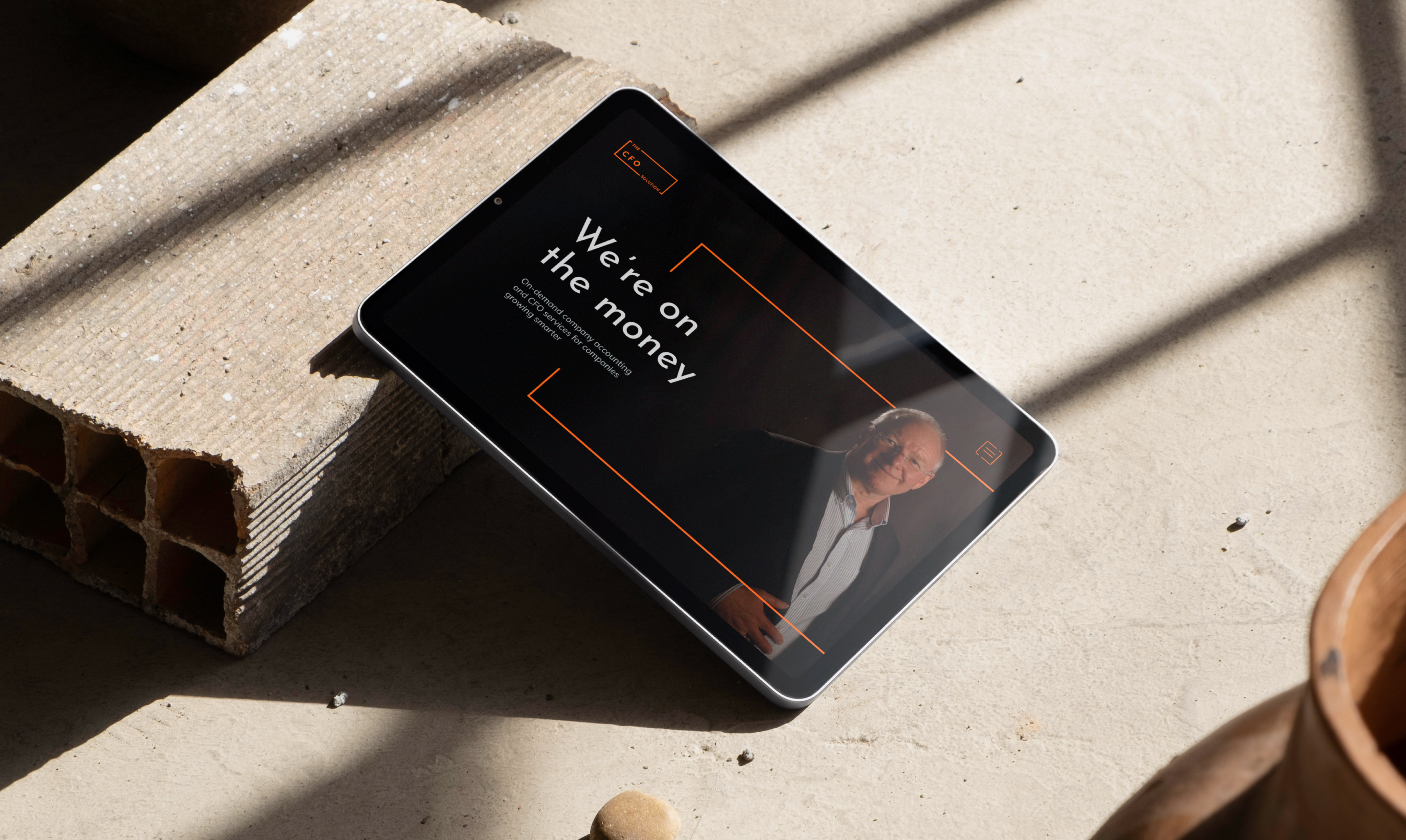
That single device gave the identity real range. At full size, it’s a confident, geometric lockup with clear hierarchy between “THE,” “CFO,” and “SOLUTION.” Scaled down, the same bracket collapses into a clean monogram CFO with the frame intact, built to survive as a favicon, an app icon, or an embossed mark on a leather folio without losing legibility.
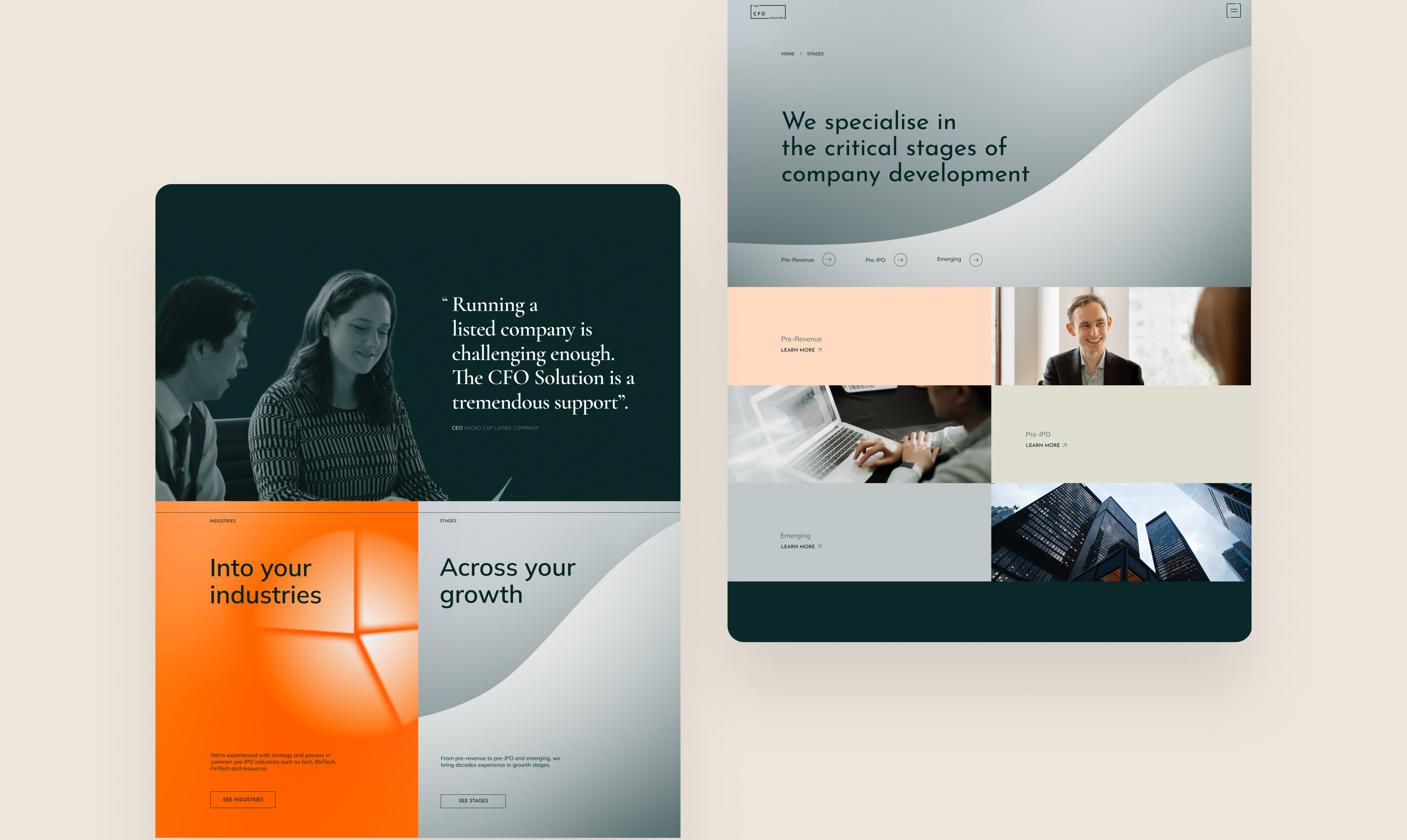
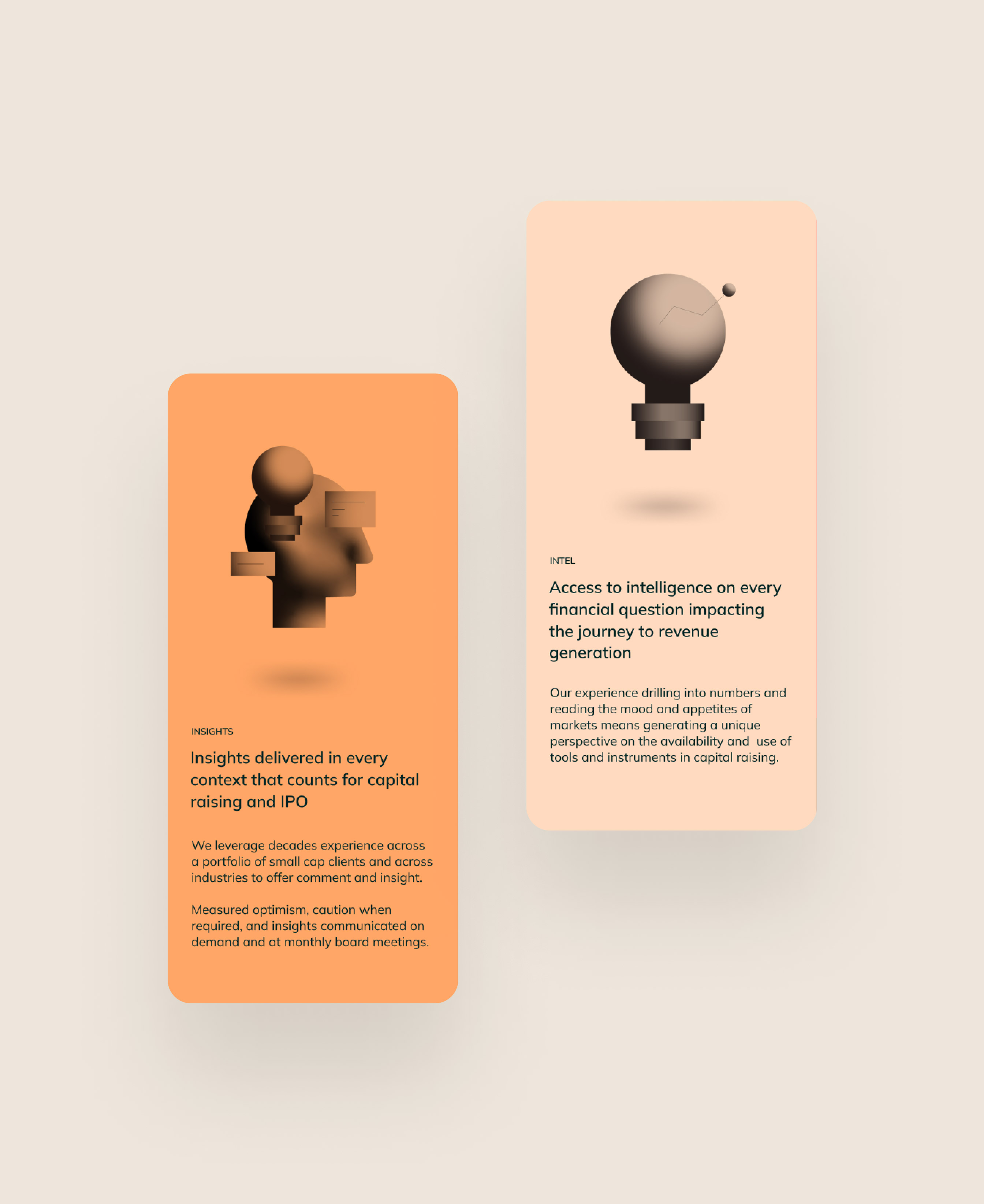
Colour did the rest of the positioning work. We moved away from the dated black-and-orange combination toward a considered palette: a deep teal-black carrying the gravitas and trust the category demands, paired with a confident, saturated orange used deliberately as an accent, a signal, a moment of energy against all that discipline. The palette speaks to integrity and trust on one hand, and engagement on the other, exactly as their brief called for.
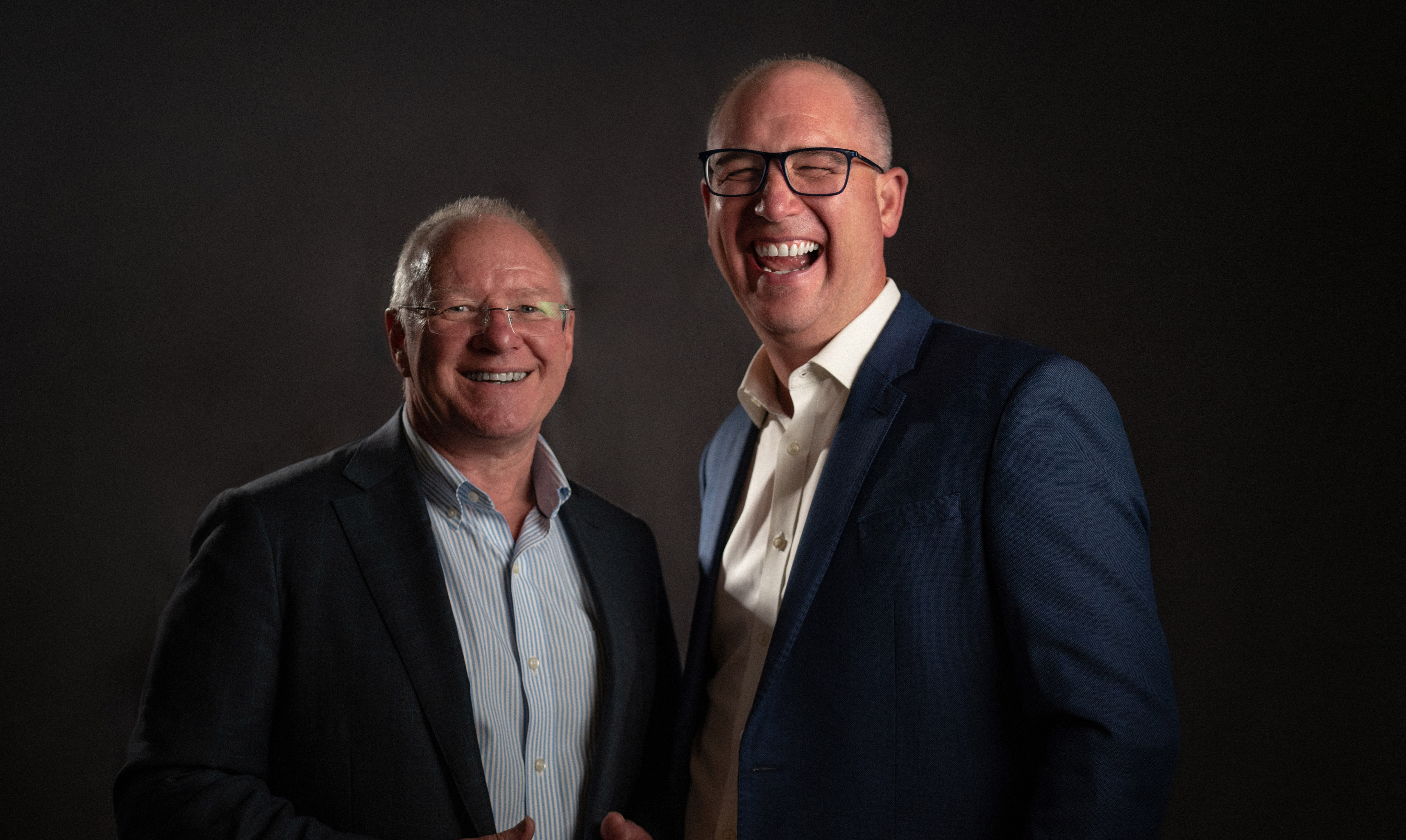
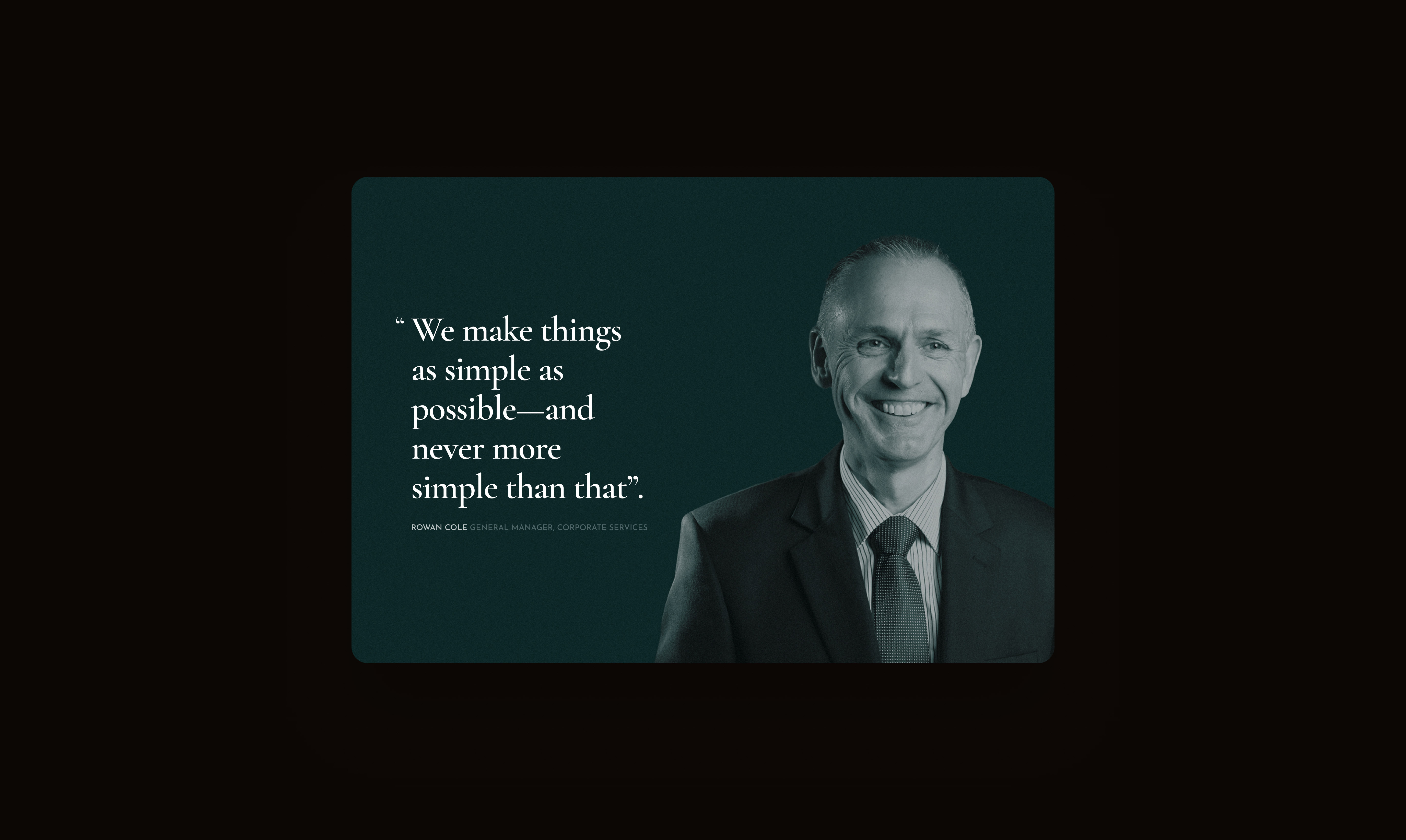
We then stress-tested the system across the real surfaces the brand needed to live on: stationery and folios, digital ad units, tablet and mobile presentations, and social platforms including LinkedIn. The open-bracket motif proved genuinely versatile cropping into abstract corner marks for backgrounds, framing photography of the firm’s advisors, and holding its own as a standalone monogram wherever “The CFO Solution” wordmark was too long to fit.
The result is a system built the way good financial advice is: rigorous underneath, but never rigid on the surface.