Driven by Design: An Obsession for the Obsessed

Driven by Design: An Obsession for the Obsessed
Index
Hunt & Hawk Senior Designer, Tim Anderson, recently embarked on a track bicycle build and found ample similarities between his side project and his ‘real job’ designing websites. Here are his intriguing insights…
Ever wondered what obsessed UX/UI designers do in their downtime? You know the type. Fanatical about every last pixel, will rattle off the nuanced history of an obscure typeface without being asked, and can often be spotted wearing nothing but black day in and day out – even in the middle of a hot Australian summer.
Not surprisingly, the answer isn’t long walks on the beach.
For me, the answer is emphatic… yet another design project.
Some people say: “variety is the spice of life”.
But you can throw that advice in the bin, because clearly those people were never passionate about anything before!
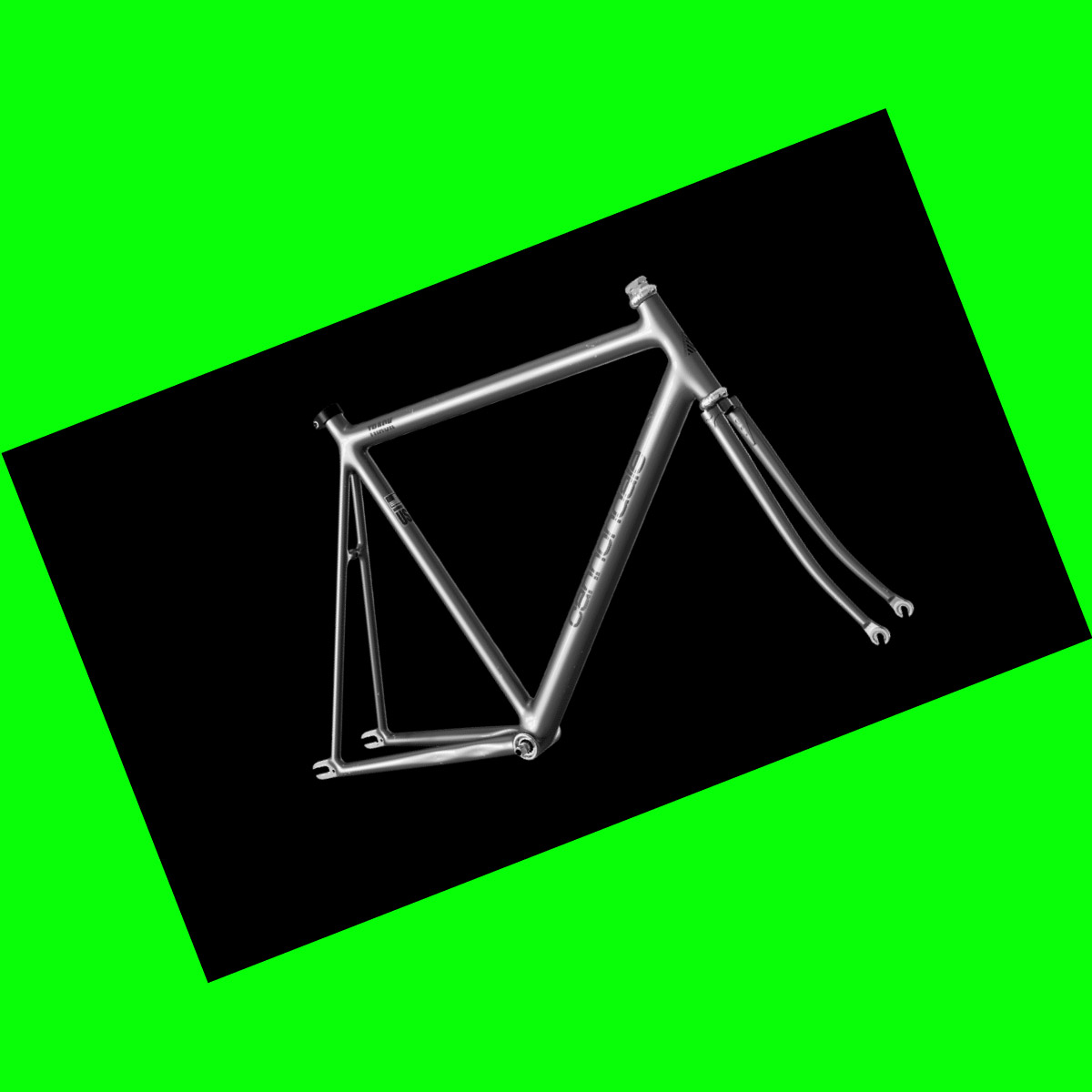
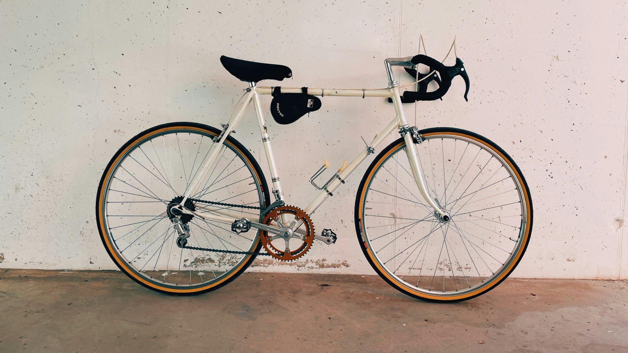
No, no, no… in my precious time away from work, I’ve actually been designing a bespoke track bicycle build.
Now in my third and final month of the project (hopefully) and with the last bolts being tightened (so I’m told), I’ve realised something. Building up a custom bike is remarkably similar to designing a website.
Not at first glance, maybe. But when you break it down, it’s almost uncanny.
Let me walk you through it. Actually let me ride you through it!
The Design
The first question I had to ask myself, and the first question our clients also face, was: do I want a large production-run bike (or website) straight off the rack from some big-box store that sells low quality products at high volume?
Or, do I want something customised to my specific wants and needs; where I have control and input for every step of the process?
A user-centric approach, tailored to the end users’ needs, will always deliver a better-performing product at the end of the day.
And the increased cost of higher grade components will repay itself back tenfold over time.
The answer was simple for me. When going all-in, it’s time to practise what you preach!
So, what were my needs?
Well, I wasn’t after a carbon superbike that required shaved legs and a small bank loan to ride… just something well-made and tailored to both my aesthetic and functional requirements.
Something that resonated with my tastes and could bring a smile to my face every time I lifted a leg over the saddle.
After some weeks of Instagram vision-boarding, I decided it would have to be steel (because steel is real, ya’ll).
It would be a fixed gear bike for the clean lines and minimal visual clutter (I am a designer, after all).
It also had to be monochromatic and understated (did I mention I was a designer?).
On top of that, it would use top-shelf Japanese, Italian, and American componentry.
I would have loved a single-origin bike (yes, it’s as pretentious as it sounds), such as an NJS Keirin race bike or a vintage Campagnolo. But as I mentioned, I wasn’t prepared to get a mortgage just so I can ride to work and besides… every project has a budget.

The Build
With the brief now outlined, I opened up Google Sheets and let rip on my masterplan.
This would be akin to the wireframing and design process, and if you’ve never assembled a bike before, you could be forgiven for thinking it might be the easy part.
A frame, some wheels, pedals, and something to hold onto right? Not even close.
All told, there were 35 individual components.
I had a cell for everything. Brands, component type, component specs, cost, colour, material, etcetera.
Not only does everything have to fit together according to the correct specifications (of which there are near-infinite subtle variations, for some reason I’m yet to understand), but it also has to look cohesive and perform as intended.
Similarly, with website design we have to consider factors like brand expression, tone of voice, visual design elements, page load speed, responsiveness, and the overall functionality of all the features.
Both processes have a build phase, too. After all, you can’t ride a pile of parcels scattered across the study floor.
Mind you, only one is performed by a denim-overall-wearing, ratchet-wielding grease monkey, and the other by an introverted ‘inside type’ who generally shuns sunlight in favour of the soft familiar glow of a computer screen.

The Similarities
In general, both bike builds and website designs will encounter unforeseen technical issues that require problem-solving and a degree of recalculation.
Or in my case, a few new parts and a solemn oath to never use the US postal service ever again!
Which brings me to today, patiently awaiting the call from my local bike shop, telling me to come in and pick up the finished product. A soft-launch, if you like.
After which there will be a few months of user-testing and iterative optimisation, tuning the saddle positioning, or adjusting the stem height to get the perfect fit.
This is all part of the process, too.
Like cycling itself, I have to learn to enjoy the ride and satisfaction of knowing I’m riding the only bike that looks and feels exactly like mine.
In the end, that’s what makes it all worth it.
Expert Design Assistance
Do you have a design project you want to obsess over? Chat with Tim and the rest of the talented Hunt & Hawk creative team today.
How would you like to interact with us?
- I’m just browsing: Explore more of our website.
- I’d like to send an email: Contact us at hello@huntandhawk.com.
- Help! Right now! Book a meeting to chat.
For more marketing, branding, and tech news, tips, and expert insights, keep exploring our blog. Or follow Hunt & Hawk on LinkedIn.