Innovative Branding Solutions in Australia: Discover How We Bring Your Brand to Life
Innovative Branding Solutions in Australia: Discover How We Bring Your Brand to Life
Index
If you’re after expert branding solutions, you’ve found the right place. We explain why.
You have an amazing product or service.
The world has to know about it, but you can’t spread the word alone.
You need a creative or branding agency to bring your brand to life—but you don’t know where to start, or what you’re even looking for.
Then, there’s the challenge of trying to work out what a creative or branding agency actually does.
So, what do you do?
How do you decide who to entrust with your brand?
Well, find an agency that can tangibly demonstrate to you what it does, and why, and how it’s relatable to your business. Proper branding solutions.
It’s what this article is all about.
Before we get started, here’s a bit about us…
At Hunt & Hawk, we provide strategic branding, marketing, and sales expertise to assorted businesses, primarily in the tech, SaaS, and professional services fields.
Branding and creative projects. Digital campaigns. UX/UI design and website development. Sales and marketing integration.
VCMO services. They’re just some of our expertise.
We don’t like being labelled an agency, though.
Rather, we believe that we’ve perfected a formula that enables businesses to scale, grow, and dominate through experiences.
At the heart of it all is a super talented and experienced bunch of in-house designers, marketing strategists, copywriters, content creators, and branding and sales experts who collaborate to execute our unique approach.
In short, we start with a unique and efficient method to understand your organisation—from your product or services to who your customers are.
We also dive into what’s working and what’s not, and explore the pain points and the opportunities.
A defining feature of the Hunt & Hawk personality is absolute honesty. No BS. In other words: we’ll share with you what our experience tells us will or won’t work, not just what you want to hear.
Having extracted as much info from you as possible—along with completing our own comprehensive research and tapping into our rich expertise—we set about developing your brand story.
This brand positioning and messaging—including snappy straplines—create the foundation from which the campaigns and visual language is developed. We don’t design superficially, just to make things look cool or trendy.
Naturally, exploiting your point of difference (PoD) is at the heart of the process.
All this groundwork is rooted in strategy and smart thinking, which helps us to create a solid visual brand that is distinctive and cohesive.
Ready to see all this in action?
Below are just some of the businesses that have reached out to us recently for branding solutions.
Our Design Director, Angelo Alcasabas, has summarised the deep thought that goes into bringing these brands to life.
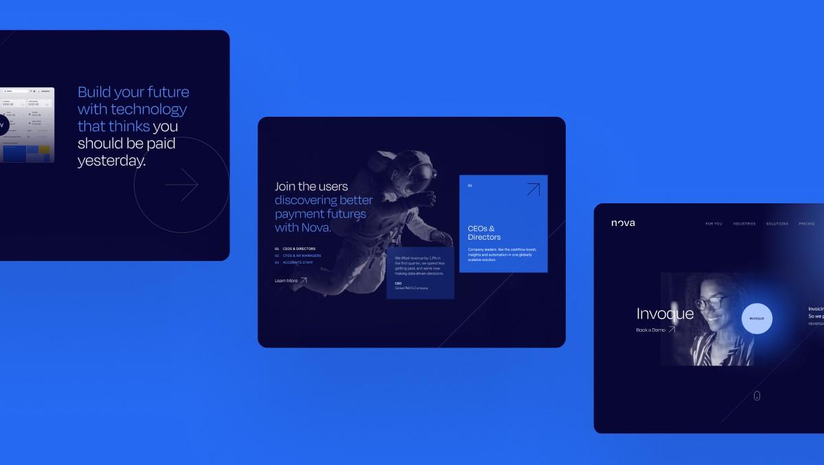
- Who: European-based invoicing software company with industry-leading tech, incorporating blockchain, AI, machine learning, and Internet of Things.
- Aim: Looking to rebrand and expand globally.
- Problem: An established brand in the Netherlands, but no brand recognition or presence outside these borders.
- Solution: Full rebrand, new website, CRM implementation, VCMO services.
- Outcome: Website traffic increased by 139% YoY.
Strategic thinking and execution…
We created a brand language and subsequent visual identity that positioned Nova Technology as an ‘illuminator’—shedding light on innovative solutions for clients grappling with invoicing challenges.
We make a science of getting paid, for every industry on the planet.
Beyond the astronomical connotation of ‘nova’, the design captures the essence of both brightness and newness in a modern, distinctive manner.
The symbol, deviating from conventional star motifs, represents Nova being lit by an unknown source, drawing inspiration from photos of the moon illuminated by the sun—metaphorically reflecting how Nova’s solutions enlighten clients.
This concept extends dynamically to the website, where the cursor acts as a literal light source.
The brand’s modernity is reinforced by the font choice and a digital-friendly blue palette with vibrant accents of yellow and pink, creating a visually compelling and future-facing brand identity.
They completely understood us, then did the creative and strategic work that made us ready to take on the world.
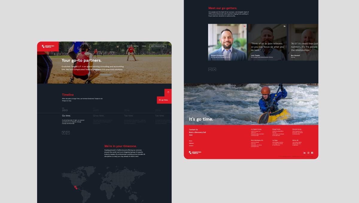
- Who: US-based financial services firm providing solutions far beyond a standard accounting practice, including litigation, cybersecurity, and forensic accounting.
- Aim: Significant growth across the US and beyond.
- Problem: Reputable company but minimal brand recognition.
- Solution: Brand overhaul, new website, VCMO services.
- Outcome: Creation of new offices across the US; overseas expansion.
Strategic thinking and execution…
Grobstein Teeple dared to be bold, not shying away from the infamous red colour associated with bad finance.
In doing so, we created a visual niche for the brand and company, which will go ‘all out’ to help its clients deal with their financial issues.
This is summed up by the strapline we landed on for Grobstein Teeple: ‘It’s go time’. Its boldness is further echoed in the brand symbol, which is geometric and formed by two L-graphic shapes that create a unique interpretation of a G and T.
The concept for the symbol is about depicting parts coming together in a dynamic, but strong way.
The use of the symbol as a graphic element and overlay unifies the design layouts while providing a playful way to lay out content.
We now communicate the world-class sophistication at the heart of all our work.
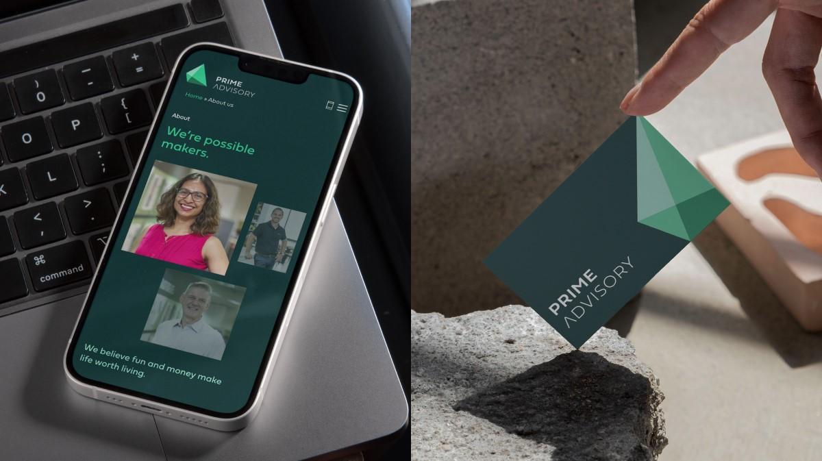
- Who: Well-established accounting and advisory firm based in Australia.
- Aim: Looking to expand business outside of its entrenched geographical reach.
- Challenge: Wanted a brand refresh to capture more attention, but wished to retain elements of its existing identity.
- Solution: Brand overhaul, VCMO team, strong emphasis on paid social campaigns.
- Outcome: Launched a new service; tripled website traffic and hit 300k social impressions in year two, driving revenue and daily leads.
Strategic thinking and execution…
PrimeAdvisory tasked us with reshaping its brand identity—including brand messaging and positioning.
After we nailed the strapline of ‘possible makers’, we took on the visual identity portion of the project… but there were conditions.
PrimeAdvisory wanted an evolution of its legacy brand and asked to retain the symbol concept—a pyramid—as well as its green colour palette.
With this, we took the dimensional shape and modernised it by cleaning up the style and updating the colours and wordmark font.
The task was not a simple modernisation of the visual brand, but a challenge to connect subtly evolved visuals to a new brand positioning.
With ‘possible makers’ as the strapline, we wanted to illustrate the feeling of positivity and opportunity.
We achieved this by transforming the ‘A’ in ‘Advisory’ to be an upwards arrow and took the style of the icon to create a pattern motif that can build like building blocks.
Additionally, the angles of the icon became a dynamic graphic overlay that provides movement to branded designs.
‘Possible starts here’ is one of our straplines, but it’s also how we see engaging Hunt & Hawk.
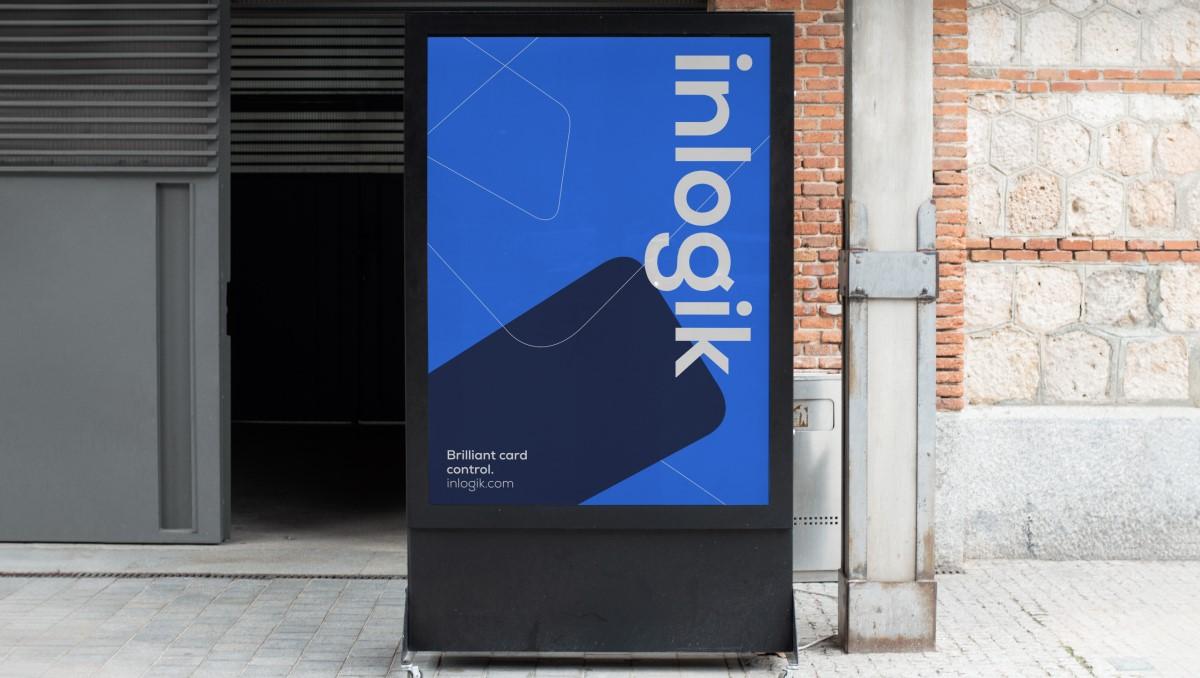
- Who: Australian-based leading corporate card management solution and banking platform.
- Aim: To crack the competitive US market.
- Problem: Confused audience and product suite.
- Solution: Strategy, brand architecture and development, CRM implementation, VCMO services.
- Outcome: Clients went from raving fans to full-blown partners.
Strategic thinking and execution…
Inlogik’s brand revolves around providing seamless corporate card management solutions, which is strongly emphasised within the supporting straplines and copy that we created.
Simple card control.
The brand positioning inspired an image of credit cards ‘suspended in space’. This idea then translated into the Inlogik symbol and a logo that highlights strength, vibrance, and optimum user control.
This style is carried over to the rest of the visual language, which uses the symbol as a graphic overlay that unifies the brand and adds variety to all design touchpoints.
Additionally, we wanted to communicate Inlogik’s trust and confidence by using a modern, digital-friendly blue colour palette, a clean and strong sans serif font for messaging, and styling imagery that feels authentic to its B2B clients.
Accessibility was also important to the client, so we strived to make Inlogik’s look and feel clear to its audience.
Our complexity dissolved, our sales took off—they made our global expansion simple.
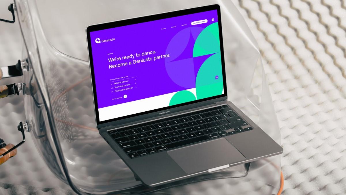
- Who: European-based disruptor with advanced banking software solutions.
- Aim: Inspiring change from a notoriously risk-averse client base.
- Problem: Mesolithic brand in urgent need of updating to generate cut-through.
- Solution: Full rebrand, new website, VCMO services.
- Outcome: 3x growth within two years.
Strategic thinking and execution…
Let’s be honest—banking can seem dull. But when you have a software solution that’s so good, it demands to be seen.
With a deep understanding of Geniusto’s advanced tech, we set about overhauling the existing brand.
It started with developing the strapline of ‘put more brains behind… your banking’—playing up the organisation’s smart solutions for smart bankers.
We then wanted to capture the essence of this messaging in the visual language—blending ‘digital’ with ‘human’.
We developed a flexible visual language that seamlessly blends techy elements with organic warmth.
The logo—a playful mix of almond and pie shapes forming the letter G—stemmed from tweaking squares in a grid, making a connection to pixels and the digital world.
This not only gave us a cool font to work with but opened the door to endless design possibilities.
The vibrant colour palette fits right into the digital landscape, and the typography is clean and geometric—befitting the Geniusto world we created: robust, smart, and interesting.
They did the impossible—they made our banking software feel smart, even sexy, to clients.
- Who: Decades-old Australian-based accounting and financial advisory firm.
- Aim: Protecting its significant loyal customer base.
- Problem: Had just undergone a merger, so had to balance its entrenched identity with a refreshed brand.
- Solution: New branding, website, and collateral.
- Outcome: Quick to launch; significant retention of existing clientele, new audience growth.
Strategic thinking and execution…
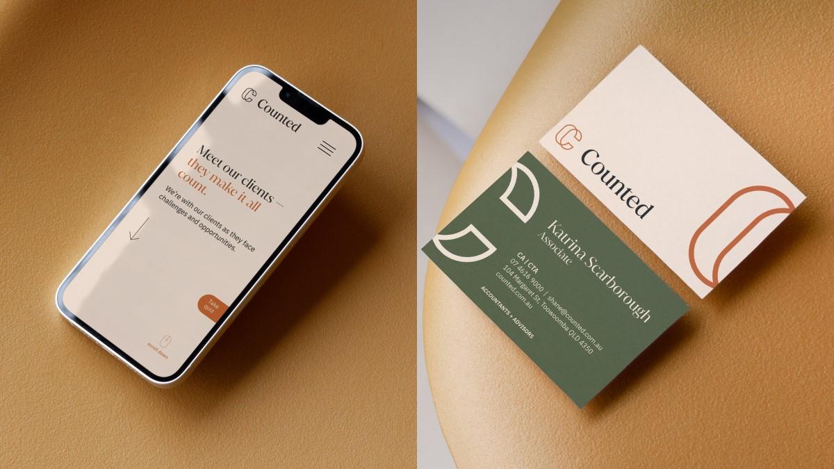
Having built up a strong following in its home base of Toowoomba, Queensland, Counted was keen to emphasise the personal connection it shares with its clients.
The strapline ‘your money matters’ accentuates this important connection—a relationship built on trust—in a simple yet powerful way.
The logo was designed to reflect this brand positioning, featuring interwoven ‘Cs’ that create a modern elegance.
We wanted to strike a balance between a personal touch and modernity, which was achieved through the use of a serif font in both the wordmark and in the typography.
The earthy colour palette and warm-toned photography further reinforce the brand’s inviting aesthetic, while the diptych style on the website serves as a visual testament to the close relationship between Counted and its clients.
We got the brand and website to immediately win people over in matters of money and trust.